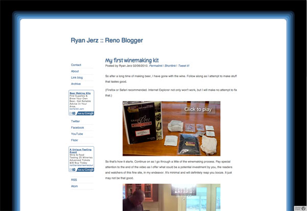
I looked for months for an easy way to make this happen. I originally tried to do it through a separate section in Textpattern, but I don’t know enough about PHP to make the sections match up, so doing it that way would require me to post everything twice—not an option. I searched every once in a while for a plugin similar to the Wordpress Mobile Plugin Pack but never found anything. Finally, about a month or so ago, I came across what might be the simplest possible solution imaginable.
It started when I found the Textpattern plugin act_if_mobile. Simply, the plugin makes it so you use a typical Textpattern tag:
<txp:act_if_mobile>
Content for mobile browser
<txp:else/>
Content for other browsers
</txp:act_if_mobile>
By placing that tag, basically, anywhere in a page template, form template, or even an article, you create a behavior that Textpattern recognizes and adheres to for mobile browsers. It’s brilliant and incredibly easy.
In order to make it work perfectly, here’s what I did (with explanations of each step to follow):
- Create a mobile stylesheet
- Insert the tag into the
<head>section of the page template along with the<meta name="viewport">tag that you can find by searching for it - Consider each post as it pertains to a mobile browser
Mobile stylesheet
The mobile stylesheet is quite simple. Once you have an idea how the page will look, you can plan it out. This site is already pretty minimal in its style, and I almost wasn’t sure if I should change anything, but ultimately I decided I should. First off, I don’t think the sidebar makes a huge difference. In looking at my analytics, I can see that the sidebar isn’t really used too often by readers, so its existence in the first place is questionable. I still like having it, so I didn’t want to remove it altogether. Anyway, I knew I had to remove the sidebar. I removed it and several other smaller parts of the site by using the display:none attribute in the CSS. You can see my mobile stylesheet here.
The <head> section
This is one part that careful attention must be paid. I use a form in Textpattern to contain my entire <head> section of the page template. The pertinent parts are shown below:
<meta name="viewport" content="user-scalable=no, width=320px" />
<txp:act_if_mobile>
<link rel="stylesheet" href="/mobile.css" media="only screen and (max-device-width: 480px)" type="text/css" />
<txp:else/>
<link rel="stylesheet" href="/style.css" type="text/css" media="only screen and (min-device-width: 481px)" />
<link rel="stylesheet" href="/print.css" media="print" type="text/css" />
</txp:act_if_mobile>
Adding those conditions with the if_mobile plugin makes it so that when a mobile browser loads the page, it pulls from the stylesheet mobile.css instead of the default stylesheet. The result is a page that, instead of this:

looks like this:

Styling posts
Because I depend on the plugin to detect the mobile versions of browsers, I have to make sure I plan every post for mobile browsers as well. When uploading images, I use Textpattern to create a thumbnail version that will fit inside the mobile layout. For me, that means images can’t be more than 300px wide. That also means I have to resize video to be no more than 300px wide when I embed YouTube, for instance.
In order to keep it looking good on both the mobile and desktop versions, I use the plugin code for each image and video embed. I put the thumbnail images and smaller video embeds under the mobile part, and the normal sized images and video embeds under the non-mobile part. So far, I have had no issues at all doing this. I think I’ve found a system that works really well for me. It also was a system that was extraordinarily easy to build and implement. And finally, it relieved me of several months of tension regarding how to make a mobile site work without hacking into the code behind Textpattern—something I’m not skilled enough to do.
I hope this can become a quick reference for anyone else experimenting with mobile versions of sites. In my opinion, it’s far more logical to detect browsers and reformat the page than it is to build separate sites based on who is visiting. Good luck, and feel free to let me know if this works for you.
As that CSS file is meant to be used on a mobile device, I recommend that that CSS file is compressed using a tool like CSS Compressor. It saves at least a tiny bit of bandwidth.
does this really work? I tried using this method with same style sheet in header as follows: media=“screen” and inserting @media only screen and (max-device-width: 480px) into the original stylesheet and still no change when testing with protofluid.
I’ve just released adi_mobile – which operates in a similar manner to act_if_mobile but has a few extra bells & whistles.